Automation of a Peer Reviewed Application Process
At TU-Berlin all experiments with human participants need an ethical justifiability authorization from the ethics commission before starting. This process could take till three months, postponing the beginning of research projects, a very frustrating situation especially for bachelor and master students, who deal with a short deadline. The delay was due to the application process being manual, relying on constant email exchanges, and paperwork.
As part of the seminar “Interdisciplinary Media-project” our team was asked to create a management system that completely automates the ethics commission application process. The team was composed by seven students, Jonas Sven Kriegs and I were responsible for the system’s UX/UI Design and Research. Some of the initial design requirements were that the system matches with the university’s online visual identity, that the application process follows peer review guidelines, and that only critical cases reach the ethics commission staff. As none of the existing open-source free software solutions fulfilled these requirements, we decided to build our system from scratch.
Starting by investigating the user flows
Research Question: what are the product’s system and user requirements?
Our team looked at the commission’s documentation searching for important requirements, but we realized that much of the procedure was not written, rather it was taught and communicated among the staff. In order to discover the application workflow, we interviewed five users, some of them were ethics commission members. Besides understanding the user flows, we wanted to identify possible pain points, the user’s mood, and expectations regarding a fully automated solution. Here are some questions that gave us these insights:
- What are the steps of an application process?
- If you had the chance, which step would you delegate?
- What are aspects to be improved in the application process?
- If you had the chance, which functionalities would you add to the process?
These interviews were the source not only for the process diagram made by the developers’ team, but also for the user stories, and prototypes created by us, the UX/UI pair. Three different personas were identified: applicant, reviewer, and secretary, the latter being responsible for coordinating the process communication. A person could not be secretary and reviewer at the same time, because in the double-blind peer review applicants and reviewers should remain anonymous for each other.
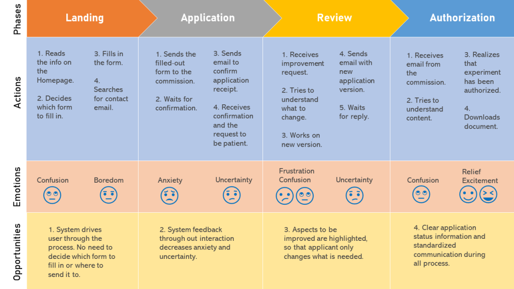
The user journey map below shows a standard applicant interaction with the ethics commission before the service automation. According to the user’s answers during the interview, the application process was dominated by uncertainty and confusion. Some improvement opportunities identified at this point were increasing system feedback and process status visibility.

Due to the very technical team background, I decided to write user profiles inspired by the interviews. Giving a face to the users is an important strategy to foster empathy while developing. Each persona corresponded to a user type and received a three-paragraph text in which they presented themselves, explained a regular interaction with the manual system, and expressed their needs and expectations regarding the automated version.

“My work as a reviewer would be much easier if the whole process could be accomplished in easy short structured steps.”
Prototyping for simplicity, transparency, and efficiency
The application starts with a self-assessment quiz that generates an automatic authorization for non-critical experiments. However, if any of the answers indicates a need for revision, the user is forwarded to fill in a full application that might be analyzed by our humans-in-the-loop. The secretary assigns the work to two reviewers in the system, who could accept the assignment or refuse it. Once accepted, the reviewer can suggest improvements in the experiment plan or totally reject it. The process was designed to be iterative and to keep track of the reviewers’ remarks made in each one of the review cycles.
While prototyping I adopted the following design principles:
- Simplicity – the prototype avoid deep browsing paths.
- Transparency – the interface communicates through status labels which action must be taken.
- Efficiency – the most urgent tasks are displayed in the top of the page, and applications waiting for review or improvement by the applicant are automatically sorted out to another list.

Prototype’s evaluation with 10 Nielsen’s heuristics
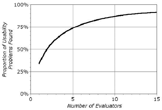
According to a survey conducted by Nielsen (1995), practitioners consider heuristic evaluation the second most useful method to identify usability problems. A heuristic evaluation is performed with the support of a UX expert, who comments on the interface using design principles as judging guidelines. The advantage of heuristic evaluation is that it enables testing the prototype in the beginning of the design phase, when changing aspects of the interface still has low costs. Moreover, only two experts can already find out 50% of the existing usability issues (Nielsen 1993), as shown in the graph below. I conducted only one evaluation session due to time constraints, though it was extremely helpful.

The prototype has been assessed by Fernanda Dias, a UX Design Lead at SAP, in a session that lasted 2:30 hours. Firstly, I explained that the project’s objective was to digitize an already existing manual process that was time consuming and had many iterations. After that, I introduced her to the system’s personas and their user journeys. Next, I told her that the session’s main goal was to assess the system’s user friendliness, and that we could use the 10 Nielsen’s heuristics to guide us through the tasks.
Some of the issues identified during the evaluation were:
- H1 – visibility of system status: in the cases where closed tabs in the online application form did not show whether the field had already been filled out.
- H2 – match between the system and real world: the homepage did not display information that fulfilled the user’s needs. This diagnose was due to the website linking forms and documents that would turn obsolete once the system is deployed.
- H3 – user control and freedom: the user was not informed in the beginning of the self-assessment quiz whether they could interrupt it and continue later.
These results were presented to the team during one of our meetings and influenced the system development. A short text addressing each one of the violated heuristics has been included in the project’s documentation, as well as a thorough session protocol with the expert’s remarks, references to the violated heuristics, improvement recommendations, and points to be discussed in the team meeting.
System validation
After the first development iteration, my colleague performed usability tests with potential users with the thinking aloud method. The five TU-Berlin students had never applied for authorization from the ethics commission before, representing the most part of our potential applicants, who access this service only once during their bachelor’s or master’s degree. An advantage of the thinking aloud method is that the participants express the intention behind their actions while interacting with the system. By analyzing their reactions, it is possible to identify emotions, such as surprise and confusion, and even to have a clue about their mental models.
During the last development iteration, we decided to gather feedback from three of our stakeholders, all very active members of ethic commissions. Because they were very busy, the sessions had to be concise and focus on a general evaluation of the system’s usefulness. Moreover, we also wanted to identify aspects to be improved before the product’s release. To avoid one stakeholder’s opinion biasing the others’ perception, we opted to schedule individual meetings. After presenting all the features through screen share, we asked them the following questions:
- How can this system help the work in the ethics commission?
- If you had the chance, what would you have made different?
Fortunately, all stakeholders were very impressed with the system’s capabilities and rated its usefulness as being high. The feedback sessions were also discussed in the team meeting and documented. Due to time constraints, some of the improvements suggested could not be integrated to the final product. These valuable insights have been included to a list of advanced features that could be used as a starting point for next product development iterations.
References:
Nielsen, J. (1993). Usability Engineering. Academic Press, San Diego CA.
Nielsen, J. (1995). Technology Transfer of Heuristic Evaluation and Usability Inspection (Keynote at the IFIP INTERACT ‘95). http://www.useit.com/papers/heuristic/learning_inspection.html [20.12.2006], 1995.
